Twitter

Thursday, November 12, 2015

What can "Cinderella", the classic children's story, teach us about model selection?

Today in my linear regression class, we accidentally realized a nice example for model selection from classic children's literature, "Cinderella."

First, we need to define our selection goal: find a suitable wife (model). Second, we need to define our selection criterion. The king wanted a "suitable mother" but the prince was looking for something more. Third, given all the possible models, we need to decide how to carry out the search, or the search mechanism. How did they search for the best fit in the story? "By royal command, every eligible maiden is to attend!" In other words, we are going to evaluate all candidate models. 

At the ball, the prince spotted his best fit. But unfortunately, he didn't save his selected model. He needs to search again. This time, he simplified his criterion to a single glass slipper (which is absurd, as if it fits perfectly it won't fall off in the first place) as he now knew the best fit have this characteristic. Due to this simplification, for the second search, the prince does not have to be the selection criterion any more. They found a good surrogate, the glass slipper. After this round of thorough search, they found the prince's match. 

The story "Cinderella" is a story on all possible regression method. Selection-criterion + all possible candidate models is the most reliable way of finding the best match. Greedy search or stochastic search do not have the same guarantee. An exhaustive search is tedious, expensive (a grand dance ball in a real palace!) and time consuming. It helps when the search criterion can be replaced by a simpler surrogate (a glass slipper as opposed to a face-to-face dance) and when the model space is small ("a tiny kingdom in a faraway land").

Friday, November 06, 2015

Identity crisis solved: I am a unicorn trainer

Last night, I watched the JSM encore on "the Statistics Identity Crisis". First, let me just say I was so relieved to learn that I am not the only one who felt the puzzlement "am I a data scientist or not?" I have never felt that tomatoes are so relatable.


Following the recommendation from the fourth talk, I also watched "Big Data, Data Science and Statistics. Can we all live together?" by Terry Speed. He compared the description of data science with his research profile and said:"I guess I have been doing data science after all." Precisely what I felt. 


Data Science, Big Data and Statistics – can we all live together? from Chalmers Internal on Vimeo.


These two videos touched on several important areas statisticians need to work on in order to be more involved in Data Science (if you want to be more involved, of course). In particular, we need to equip our students with problem solving skills, programming and "hacking" skills, collaboration and communication skills. These skills cannot be taught in the conventional pedagogy in Statistics. It would require more real-data projects with open-end problems and opportunity to collaborate with non-statisticians. It would require to encourage the students to be never satisfied with their models, their codes and their visualization/presentation, and strive for better models, faster  algorithms and clearer presentation. This has been a focus in every research project of mine with my PhD students. I love how Professor Lance Waller from Emory University hacked his business card to give himself a title of "unicorn trainer." My current PhD students are packing up domain knowledge and computing skills in parallel computing, data management and visualization in their individual projects, in additional to their research in statistics and machine learning. In other words, they are indeed becoming unicorns.


Next semester, I will be teaching a course on "Applied Data Science" that is data-centric and project-based. It will not be organized by methodology topics as the pre-requisites cover both statistical modeling and machine learning. Every 2-3 weeks, we will explore analytics on a type of non-traditional data. There will be a lot of discussion, brain-storming, real-time hacking, code reviews, etc. It is intended for graduate students in Statistics to gain more data science skills and overcome the fear towards the real-world messiness in real data (big or small). Hopefully, we can get some unicorns-to-be out of this course as well. 


Incidentally, I ran into ASA's statement of the role of Statistics in Data Science today. My favorite quote from this statement is:
For statisticians to help meet the considerable challenges faced by data scientists requires a sustained and substantial collaborative effort with researchers with expertise in data organization and in the flow and distribution of computation. Statisticians must engage them, learn from them, teach them, and work with them.

Sunday, November 01, 2015

Several pointers for graduate students in 140 characters

I gave a casual "speech" in a recent casual pizza hour for our MA students. It was intended to be a chat but the students didn't ask many questions and I just went on and on. So it felt like a speech. One of the students tweeted:


I couldn't have summarized better.

Wednesday, October 28, 2015

Prediction-oriented learning

Our paper on "Why significant variables aren’t automatically good predictors" just came out on PNAS. Here is the press release.

This paper was motivated by our long-time observation of variables selected using significance tests often (not always) perform poorly in prediction. This is not news to many applied scientists we spoke to but the reason for this phenomenon has not been explicitly discussed. Incidentally, also observed in our own research, variables selected using our own I score seem to do better.

Through the course of writing this paper, we came to realize how significance and predictivity are fundamentally different. For example, for a set of variables, its innate predictivity (or power to discern between two classes) does not depend on observed data while significance is a notion applied to sample statistics. As sample sizes grow, most sample statistics relevant to the population quantities that decide predictivity will eventually correlate well with predicitivity. However with finite samples, significant sets and predictive sets do not entirely overlap.

In our project, we tried various simulations to illustrate and understand this disparity, some of which are too complicated to be included in our intend-to-be-accessible paper. For example, using a designed scenario, we manage to recreate the Venn diagram above using simulations. 


Using observed data while evaluating variables for prediction, we inevitably have to rely on certain "sample statistics". We have found in our research presented in our paper, certain prediction-oriented statistics would correlate better with the level of predictivity and test statistics may not. This is because test statistics are often designed to have power to detect ANY departure from the null hypothesis but only certain departures will lead to substantial improvement in predictive performance. 


Friday, October 09, 2015

Re-vision Minard's plot

Minard's plot is a famous example in the history of visualization. Using thickness of lines, it clearly documented Napoleon's fateful defeat in 1812.
Many have attempted to recreate this graph using modern tools. Here is mine using my favorite and only data science programming tool, R. It can still be improved as when the line turns sharply, the thickness are off. I got lazy with algebra.


Thursday, October 08, 2015

Debugging the good results

You have a data set and an idea to model the data, in the hope that it will provide some information or solution to a problem. In the ideal world, you shall just cast the idea on the data like a never fail spell and, ta-da, the solution shall just pop out of thin air.

It does not happen in the real world. Even in the wizard world, when an angry Harry Potter tried to use the Cruciatus spell on an opponent, yet he failed. You-know-who commented "you've got to mean it, Harry." It takes both strong willpower and skill to execute a powerful spell. The execution is the vessel that carries an idea. If the vessel sinks, so goes the idea too.

Now let's talk about debugging. The reason we debug our analysis and codes is our codes and the analysis results they generate are prone to mistakes. We are all aware of that. However, our drive to diligently debug our codes is strong only when we are not getting the desired outcomes from our codes.

Regina Nuzzo (@ReginaNuzzo) wrote in her recent Nature news feature:
“When the data don't seem to match previous estimates, you think, 'oh, boy! Did I make a mistake?'”
However, not all coding errors give silly results. Some, on the contrary, give pretty "good" results. Results we have been hunting for. It takes strong willpower to check, proofread and debug to reduce the chance of false results. Over the years, I have had my fair share of false good results produced by programming errors. Therefore, to reduce the risk of cardiovascular arrest, members of my group tend to be more diligent when the results found are extremely exciting. Incidentally, both two of my graduate students who recently presented good results (results that agree with our intuition) in our weekly meeting said they will check their codes more carefully at the end of the meeting.

Wednesday, October 07, 2015

Animated plot using R package animation

Step 1: install imageMagick
Step 2: write a loop that create a sequence of plots.
Step 3: use saveGIF({ }, ...)


Tuesday, September 22, 2015

Usage trends on R and Python (2014 to 2015)

From a latest KDknuggets poll, both R and Python have furthered their dominance as programming language for analytics, data analysis, data mining and modeling. As a self-learning task, I made my very first chord diagram using the R package circlize. It was quite easy to use and took me about 2 minuets to make a first draft and another 30 minuets to refine the layout, color, etc (given I was remote desktoping from an iPad to my 10 years old windows PC in my office!).
It is shown here that both Python and R gained new users. The biggest movements are from previous R-only or Python-only users who decided to adopt the other programming language. This is natural as R and Python offer very different user experiences and in some areas complement each other. For new analytics researchers/data scientists with no or little prior experience, they almost exclusively chose R as a starting point. For users who decide to start using Python, they all had prior programming experience. 

This confirms what I have been speculating (which by no means can be claimed as novel or original).  The most attractive aspect of R is its relative ease of use. R has its own programming challenges and can sometimes hard to debug. But for new users, it does not take long for them to start hacking data. This is precisely the bottleneck for Python. Not everyone is willing to make the leap into scripting programming. The problem areas for R are computing speed, memory management and its interface with other programming tools, all of which are improving. For statisticians, we can leverage our years of experience with R and learn new computational tricks and new tools from other languages that have been interfaced with R, without the need to leave R. 

Here is the R code
> mat.v
             R2015 Python2015 other2015 none2015
R2014      0.40480     0.0506   0.00460    0.000
Python2014 0.01771     0.2093   0.00529    0.000
other2014  0.04370     0.0253   0.16100    0.000
none2014   0.04400     0.0000   0.00000    0.036
> circos.clear()
> circos.par(start.degree=-105)
> circos.par(gap.degree=c(rep(2, nrow(mat.v)-1), 30, 
                          rep(2, ncol(mat.v)-1), 30))
> chordDiagram(mat.v, order=c("R2014", "none2014", 
                             "other2014", "Python2014",
                             "Python2015", "other2015", 
                             "none2015", "R2015"), 
              grid.col=grid.col, directional=TRUE)


Monday, September 07, 2015

ASA SLDM call for papers (JSM 2016)

Call for papers
Student Paper Competition-JSM 2016
(July 30th-Aug 4th, 2016, Chicago, IL)
ASA Section on Statistical Learning and Data Mining
Jointly sponsored by SLDM and PANDORA

Key dates:
• Abstracts due December 15th, 2015
• Full papers due January 4th, 2016

The Section on Statistical Learning and Data Mining (SLDM) of the American Statistical Association (ASA) is sponsoring a student paper competition for the 2016 Joint Statistical Meetings in Chicago, IL, on July 30th-August 4th, 2016.

The paper might be an original methodological research or a real-world application (from various fields including but not limited to marketing, pharmaceutical, genomics, bioinformatics, imaging, defense, business, public health) that uses principles and methods in statistical learning and data mining.

Papers that have been accepted for publication are NOT eligible for the competition. Selected winners will present their papers in a designated session at the 2016 JSM in Chicago, IL organized by the award committee. In this session, they will be presented a monetary prize and an award certificate. Winning papers will be recommended for submission to Statistical Analysis and Data Mining: The ASA Data Science Journal, which is the flagship journal of the SLDM Section.

Graduate or undergraduate students who are enrolled in Fall 2015 or Winter/Spring 2016 are eligible to participate. The applicant MUST be the first author of the paper.

Abstracts (up to 1000 characters) are due 12:00 PM (noon) EST on December 15th, 2015 and shall be submitted via this Abstract submission form (http://goo.gl/forms/HHMZ1051Lt). ONLY students who submit their abstracts on time are eligible for submitting full papers after 12/15/2015.

Full papers and other application materials must be submitted electronically (in PDF, see instruction below) to Professor Tian Zheng (tian.zheng@columbia.edu) by 12:00 PM (noon) EST on Monday, January 4th, 2016. ONLY students who submit their abstracts by 12/15/2015 are eligible for submitting full papers.

All full paper email entries must include the following:
  1. An email message contains:
    • List of authors and contact information;
    • Abstract with no more than 1000 characters.
  2. Unblinded manuscript - double-spaced with no more than 25 pages including figures, tables, references and appendix. Please use 11pt fonts (preferably Arial or Helvetical) and 1 inch margins all around.
  3. Blinded versions of the abstract and manuscript (with no authors nor references that could easily lead to author identification).
  4. A reference letter from a faculty member familiar with the student's work which MUST include a verification of the applicant's student status and, in the case of joint authorship, should indicate the fraction of the applicant's contribution to the manuscript.
All materials must be in English.

Entries will be reviewed by the Student Paper Competition Award committee. The selection criteria used by the committee will include statistical novelty, innovation and significance of the contribution to the field of application as well as the professional quality of the manuscript.

This year’s student competition is sponsored jointly by SLDM and PANDORA and is chaired by Professor Tian Zheng (Columbia University). Award announcements will be made in mid-January 2016. For inquiries, please contact Professor Tian Zheng (tian.zheng@columbia.edu).

A simple solution for R vioplot cut() error

I am using R's violin plots to visualize side-by-side comparison of empirical distributions. At some specifications, the simulated values can all equal to a constant. That will cause the following error.
Error in cut.default(x, breaks = breaks) : 'breaks' are not unique
To resolve this problem, one can try the following simple fix: Instead of vioplot( x, ...). Input vioplot( x+rnorm(length(x), 0, 1e-6), ... Or simply use the function jitter().The variance of the random noise should be much smaller than the scale of x.

Friday, August 21, 2015

Discussing "Statistical Methods for Observational Health Studies" (JSM 2015)

This post is based on my recollection of what I discussed in the session on "Statistical methods for observational health studies" that I organized. There has been a boom of such studies due to availability of large collection of patients records and medical claims.

The analysis of the "big data" from health studies is different from many machine learning tasks in two ways. First, association is not enough. Identification of causal relations is essential for any possible intervention. Second, detection of an effect may not be enough. Often precise and accurate estimates of the effect size are desired. Strongly!

In dealing with observational health studies, here are some of my advices, which are not intended to be comprehensive.

  • Understand the available data; especially understand what was not observed. When you do not have full control of the study design/data collection, there would always be some issues: sampling bias, informative bias, measurement bias. Always ask questions about what the measured data actually represent: how were the data cumulated? how were certain measures defined?
  • Know what your methods are estimating: association, causality or granger causality? effect size under a particular model may not reflect the actual true effect size. What are the questions that need answer? What are the questions your methods can actually address?
  • Always carry out some sensitivity analysis: are your results sensitive to model assumptions, or small changes in the data? Available tools include simulations, multiple data sets or resampling. This can be challenging for certain studies as defining "agreement" between different findings can be tricky.
  • Always report uncertainty: combining estimated sampling error from modeling and results from sensitivity analysis give the users of your results a better sense of uncertainty. This is especially important when modeling strategies were introduced to address a small area estimation problem.

Tuesday, August 18, 2015

The fifth V of Big Data: variables (JSM 2015 discussion)

I gave the following discussion (from recollection and my notes) during the session "the fifth V of Big Data: variables" organized by Cynthia Rudin.

The notion "Big Data" does not simply refer to a data set that is large in size. It includes all complex and nontraditional data that do not necessarily come in the form of a typical clean Excel sheet with rows corresponding to individuals and columns corresponding to variables. In other words, Big Data are often unstructured and do not have naturally defined variables.

Variables are central to nearly all statistical learning tasks. We study their distributions to build models and predictive tools. Therefore, in Big Data, how to define variables is one of the important first steps that is critical for the success of the statistical learning later on. This step is also known as feature generation. Even when some variables are observed on individuals in a data set, they often do not come in the form or scale most relevant with the learning task at hands. Domain knowledge, when used correctly as we have learnt from Kaiser's talk, is often the most helpful in identifying and generating features. At other times, we need some help from such as exploratory data analysis, sparse learning and metric learning to form nonlinear transformation.

For variables generated, they first need to predict well, i.e., achieve accuracy. In addition, for many application, they need to be interpretable. Here, sometime we need to strike a balance between these two criteria. One way to achieve such a balance is to encourage sparsity in the solution, which is often computational challenging.

Variables, the fifth V of Big Data, are essential for most statistical solutions and require a delicate three-way balance of accuracy, interpretability and computability.

Friday, April 17, 2015

My new cloud computer, which will never need to upgrade?

What have been stopping me from upgrading my computer is the pain to migrate from one machine to the other. Over the years, I have intentionally made myself less reliant on one computer by sharing files across machines using dropbox or google drive. I still have a big and old (see note below) office desktop that holds all my career (or most of it). Every time I need to work on something, I put a folder in the dropbox and work on the laptops on the go, at home, in a coffee shop.

Using Columbia's Lion Mail google account, we receive 10 TB cloud storage on google drive. This is more than enough to hold all my files. A personal PC should have the following components: file storage, operating system, input/output devices, user softwares and user contents. I just decided to move the file storage/user content component of my computer onto the cloud. Next step would be moving the most essential user softwares onto the cloud and remotely connect to the cloud from any web browser to work. I can't wait to set up a remote cloud-based R studio server to try out.

This whole thing started when I was searching for a faster desktop replacement. I saw the price required to buy the best available desktop and compared it with the pricing of cloud computing engines. The $8000 price tag or higher of a most powerful PC/Mac will afford me non-stop computing on a 16-core cloud engine with 64MB or higher for two full years. Consider the idle time a PC is likely to have, it may be equivalent to 4-5 years. It seemed to me the best "personal" computer now is on the cloud.

Will this remove the need to go through the upgrading of our dearest work laptop? Not completely. We will still be buying new laptop to work on. But it will be more like upgrading an iPhone or iPad. This thought is enough to make my heart sing.

Note: my office pc was born 2006 and still going strong. Following an advice my mom, a computer science professor, gave me about 20 years ago, I bought the best specification possible at that time.

Thursday, March 12, 2015

The trinity of data science: the wall, the nail and the hammer

In Leo Breiman's legendary paper on "Statistics modeling: the two cultures" a trend in statistical research was criticized: people, holding on to their models (methods), look for data to apply their models (methods). "If all you have is a hammer, everything looks like a nail," Breiman quoted.

A similar research scheme was observed recently in data science. The availability of large unstructured data sets (i.e., Big Data) have sparkled imagination of quantitative researchers (and data scientists wanna-be) everywhere. Challenges such as the Linked-In economic graph challenge have invited people to think hard of creative ways to unlock the information hidden in the vast "data" that can potentially lead to novel data products. The exploratory nature of this trend, to some extent, resembles the quest of a hammer in search for nails. Only this time, it is a vast facet of under-utilized wall in search of deserved nails. Once the most deserved nails (or hooks and other wall installations) are identified, the most appropriate hammers (or tools) will be identified or crafted for the installation of them.

In every data science project, there is this trinity of three basic components: the problem to be addressed, the data to be used and the method/model for the hack.
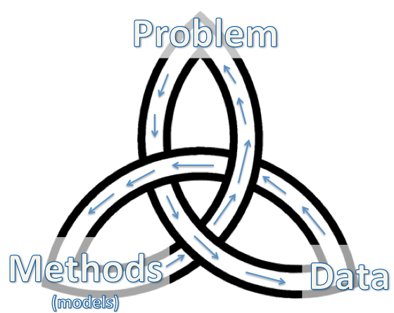
The Trinity of Data Science

Traditional statistical modeling usually starts with the problem, assuming certain generative mechanism (model) for a potential data source, and device a suitable method. The hack sequence is then problem-data-methods (or first start with the nail, then choose which wall to use, and then decide which hammer to use, considering the nature of the nail and the wall).

Data mining explores data using suitable methods to reveal interesting patterns and eventually suggests certain discoveries that addresses important scientific problems. The hack sequence is then data-methods-problem (the wall, the available hammers, and the nails).

Data scientists enter this tri-fold path at different points, depending on their career path. The ones from an applied domain have most likely entered from a problem entry point, then to data and then to methods. It is often very tempting to use the same methods when one moves from one set of data to the next set of data. The training of these application domain data scientists often comes with a "manual" of popular methods for their data. Data evolve. So should the adopted methods, especially given the advancements in the methodological domain. The hammer used to be the best for the nail/wall might no long be the best given the current new collection of hammers. It is time to upgrade.

Methodological data scientists such as statisticians enter from the methodological perspective due to their training. When looking for ways to apply or extend their methods, they should consider problems where their methods might be applied and then find good data for the problem. In the process, one should never take for granted that the method can just be applied to the problem-data duo in its original form.

Computational data scientists and engineers often started from manipulating large data sets. These Algorithms were motivated by previous problems of interests or models that have been studied. When a similar large set of data become available, the most interesting problems can be answered by this set of data might be different from the ones have been addressed before in another data set. One should use creative methods to identify novel patterns in such data and discovery interesting problems to answer.

Looking at this trinity map of data science, it is then easy to understand that, for some, there will naturally be phases when one knows a few methods (from their training, or prior hacks of data sets) and looks for (other) data sets or problems to hack; and for some others, there will be phases when one has a big data set and looks for problems that can be answered by this data set. And there will also be those who start with a problem, find or collect data and apply existing or novel methods on the data.

These are all valid and natural "entry points" into data science. The most important thing here is that one remembers that there are many different hammers, many different nails and many different walls. A quest of a data scientist shall always be on finding the best match for the wall, the nail and the hammer and be willing to change, improve and create.

Wednesday, February 11, 2015

A statistical read about gender splits in teaching evaluations

A recent article on NYT's upshot shared a recent visualization project of teaching evaluations on "rate my professor", 14 millions of them. Reading this article after a long day in the office made me especially "emotional." It confirmed that I have not been delusional.
It suggests that people tend to think more highly of men than women in professional settings, praise men for the same things they criticize women for, and are more likely to focus on a woman’s appearance or personality and on a man’s skills and intelligence.
Actually, the study didn't find people focus on a woman's appearance as much as expected. 

The article made an important point:"The chart makes vivid unconscious biases. " The 14 millions reviewers were not posted to intentionally paint a biased picture of female professors compared with their male colleagues. The universities didn't only assign star male professors to teach alongside of mediocre female professors. Online teaching evaluations have known biases as people who feel strongly about what they have to say are more likely to post reviews. But this selection bias cannot explain away the "gender splits" observed. They are due to "unconscious biases" towards women.

What does this term, "unconscious biases", actually suggest? It suggests that if you are thinking that you are being fair to your female colleagues, female students or professors, you are probably not. If the biases were unconscious, how can we possibly assert that we do not have them? Most of those who wrote the 14 millions review must have felt they were giving fair reviews. Therefore, statistically speaking, if 14 millions intended "fair" reviews carried so much unconscious biases, we then have to act more aggressively better than just being fair to offset these unconscious biases.

Friday, January 30, 2015

Lego, sampling and bad-behaving confidence intervals

Yesterday, during the second lecture of our Introduction to Data Science course for students in non-quantitative program. We did a sampling demo adapted from Andrew Gelman and Deborah Nolan's teaching book (a bag of tricks).

Change from candies to legos. The original teaching recipe uses candies. A side effect of that is the instructor will always get so much left over of candies as the students are getting more and more health conscious. So this time, I decided to use lego pieces. One advantage of this change is that we can save the kitchen scale and just count the number of studs (or "points") on the lego pieces.

Preparation. The night before I counted two bags of 100 lego pieces: population A and population B. Population A consists of about 30 large pieces and 70 tiny pieces. Population B consists of 100 similar pieces (4 studs, 6 studs and 8 studs).

In-Class demo. At the beginning of the lecture, we explained to the students what they need to do and passed one bag to half of the class, and the other bag to the other half, along with  data recording sheets.

Results. Before class, I asked a MA student, Ke Shen, in our program who is very good at visualization and R to create a RShiny app for this demo, where I can quickly key in the numbers and display the confidence intervals.

Here are population A samples.
Here are population B samples. 

Conclusion. Several things we noticed from this demo:
  1. sampling lego pieces can be pretty noisy. 
  2. all samples of population A over-estimated the true population mean (the red line). samples of population B seemed to be doing better. 
  3. population variation affects the width of the confidence intervals. 
  4. but even wider confidence intervals were wrong due to large bias.